
Project description
In 2015 unemployment rates were low in the state of Minnesota, which seemed like a good thing but it’s not truly reflective of the employment landscape. Many are under employed and struggling to make ends meet. Additionally, there is a lack of talented specialists that are necessary to make businesses flourish.
State governments have taken notice and are approaching solutions in different ways. Minnesota decided to take an innovative approach to address some of the complex workforce issues with their new CareerForce platform. They understand that there are many underserved undertrained people that need services and education opportunities to become ideal candidates. Their approach is to look at individuals who have the largest gap in employable skills, and train them for the many job openings for the prosperity of the economy. These populations are broad and have many different and specific needs.
Minnesota’s CareerForce platform is a one-stop workforce development resource solution that improves access to resources for job seekers, employers, and workforce partners.
ROLE
As the lead User Experience Strategist I worked alongside the PortlandWebworks team to lead a User Center Design approach to innovate Minnesota DEED’s Career Center website. Additionally, I spoke to project stakeholders and users to gather requirements, conducted in person research studies, created an online card sort study, created a tree testing study to define the IA, developed user personas, defined user workflows, created wireframes, and assisted in the creation of a functional prototype.

Source: https://unsplash.com/photos/s9CC2SKySJM
User Research
Know your users
The most important step of the User Centered Design process is to research your users and their behaviors. This can be accomplished through various user research gathering techniques, we decided the most logical studies for the project needs were: unstructured stakeholder interviews, card sorts, surveys, and tree testing.
Talk to your users
We traveled to Minnesota for 3 days of in person interviews with various stakeholders to gather data to inform our personas and usability goals. Some of the individuals we met with were: workforce staff members, community partners, local employers, advocates for diversity equity & inclusion, Minnesota IT Service / Department of Employment and Economic Development staff, business and economic development team, communications team, career onestop team, labor market data analysts, branding team, digital literacy team, and the state commissioner. We distilled all of their feedback into content for our personas and requirements definitions.
Critical components
Resources
CareerOneStop - the flagship career, training, and job search website for the U.S. Department of Labor, Labor Market Information tools, Become familiar with Workforce Innovation and Opportunity Act programs and services.
CareerOneStop - the flagship career, training, and job search website for the U.S. Department of Labor, Labor Market Information tools, Become familiar with Workforce Innovation and Opportunity Act programs and services.
Content Strategy
Surface personalized content based on the user persona and selected career path.
Surface personalized content based on the user persona and selected career path.
Community Events
Promote community workshops and employment events to learn new job skills and job seeking techniques.
Promote community workshops and employment events to learn new job skills and job seeking techniques.
Job Search tool
View open job postings in your area that match your skillset.
View open job postings in your area that match your skillset.
Employers and Organizations networking
Provide a community forum for employers and organizations to connect to gather talent and provide job seekers educational opportunities.
Provide a community forum for employers and organizations to connect to gather talent and provide job seekers educational opportunities.
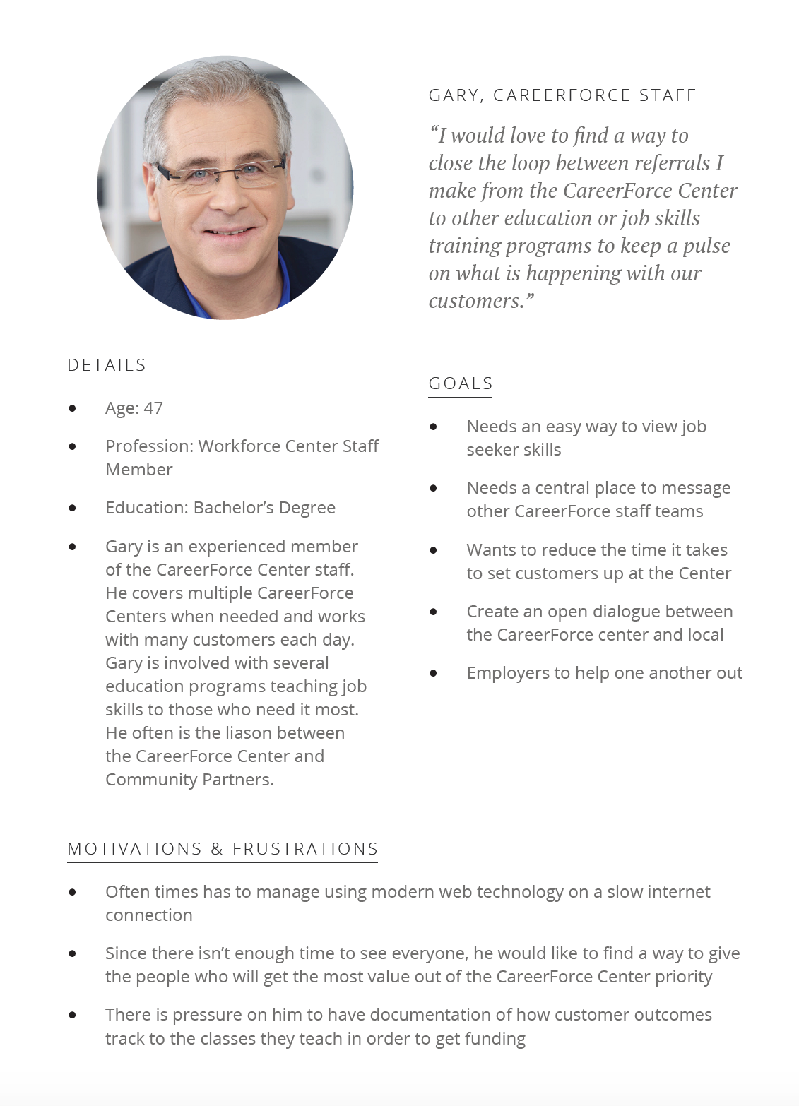
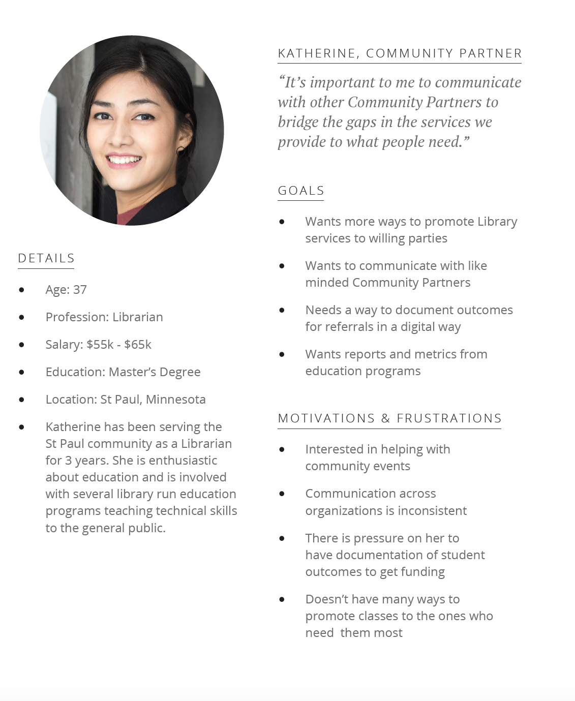
Personas


usability goals
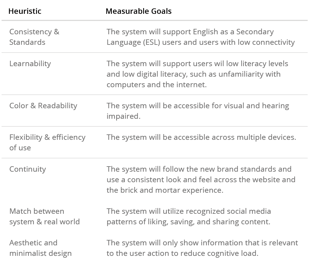
Set GOALS based on best practices
We set usability goals based on the following industry standard design principles:
• Tognazzini’s Basic Principles for Interface Design — defined by Bruce Tognazzini of Neilsen Norman Group, who created the design for Apple’s first human interface.
top 5 use cases
1. Sign up for classes
Job Seekers need to learn new skills to improve their chances of being hired.
Job Seekers need to learn new skills to improve their chances of being hired.
2. Communicating with Employers
CareerForce Staff will frequently need to communicate with Employers.
CareerForce Staff will frequently need to communicate with Employers.
3. Post a new class
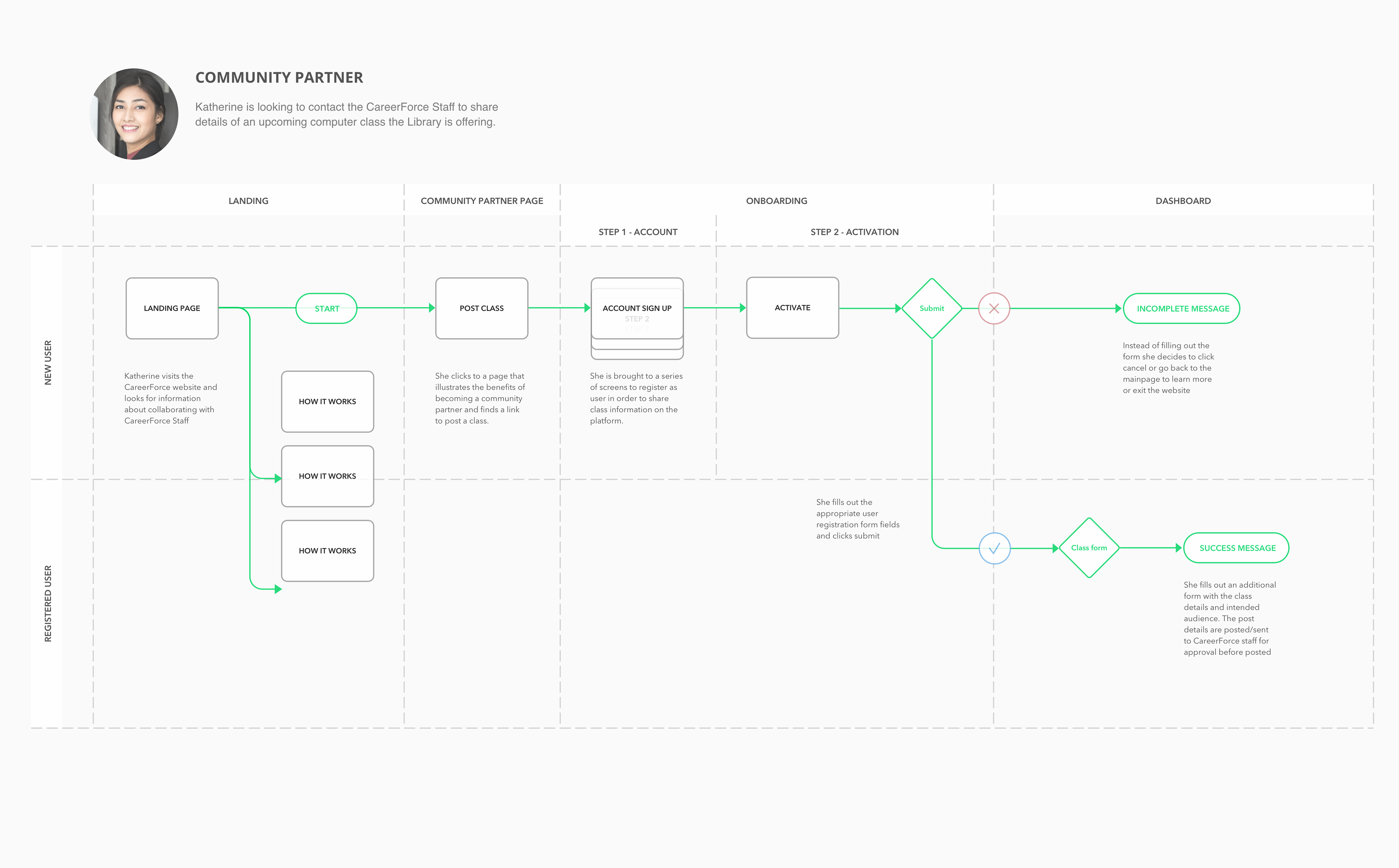
Community Partners need a way to contact the CareerForce Staff to share details of educational classes they are offering.
Community Partners need a way to contact the CareerForce Staff to share details of educational classes they are offering.
4. Contact CareerForce Staff
Employers need a way to consult with CareerForce staff to learn more about skill gaps, labor market trends, and how CareerForce staff can assist them in finding talent.
Employers need a way to consult with CareerForce staff to learn more about skill gaps, labor market trends, and how CareerForce staff can assist them in finding talent.
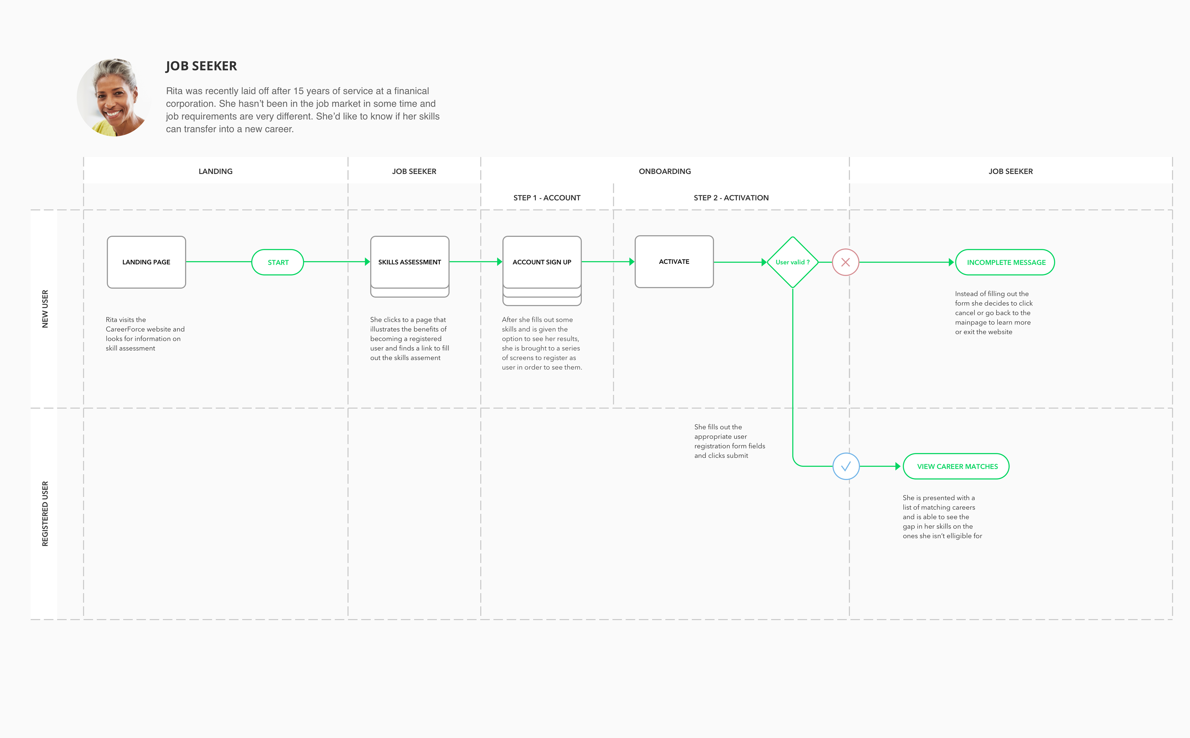
5. Career skill matching tools
Job Seekers that are looking to switch careers need a way to learn which job opportunities best match their current skillset.
Job Seekers that are looking to switch careers need a way to learn which job opportunities best match their current skillset.
workflows
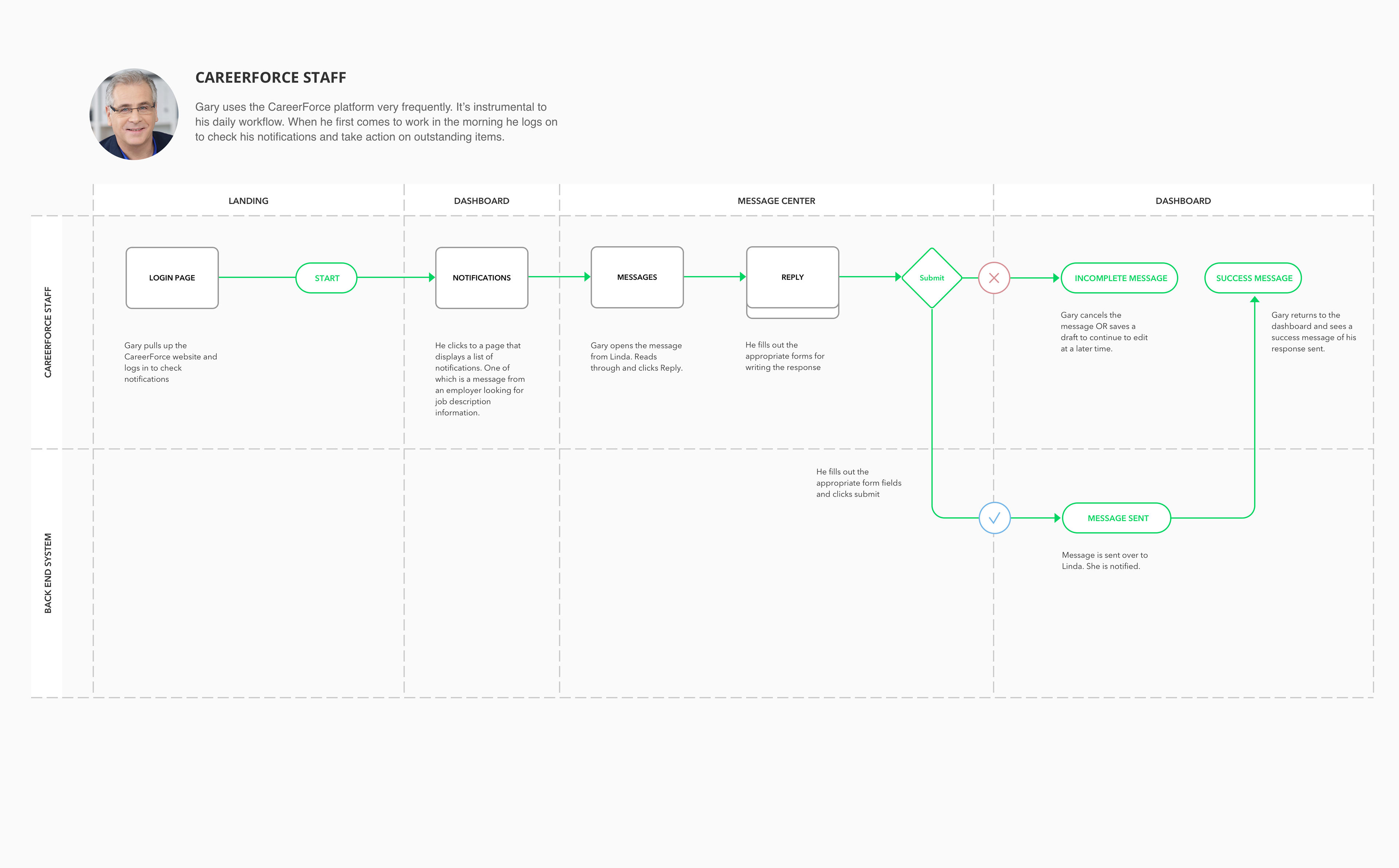
CareerForce Staff - Check notifications
Community Partner - Message CareerForce Staff

Employer - Inquire about talent
Job Seeker - Discover Careers that match their Skillset
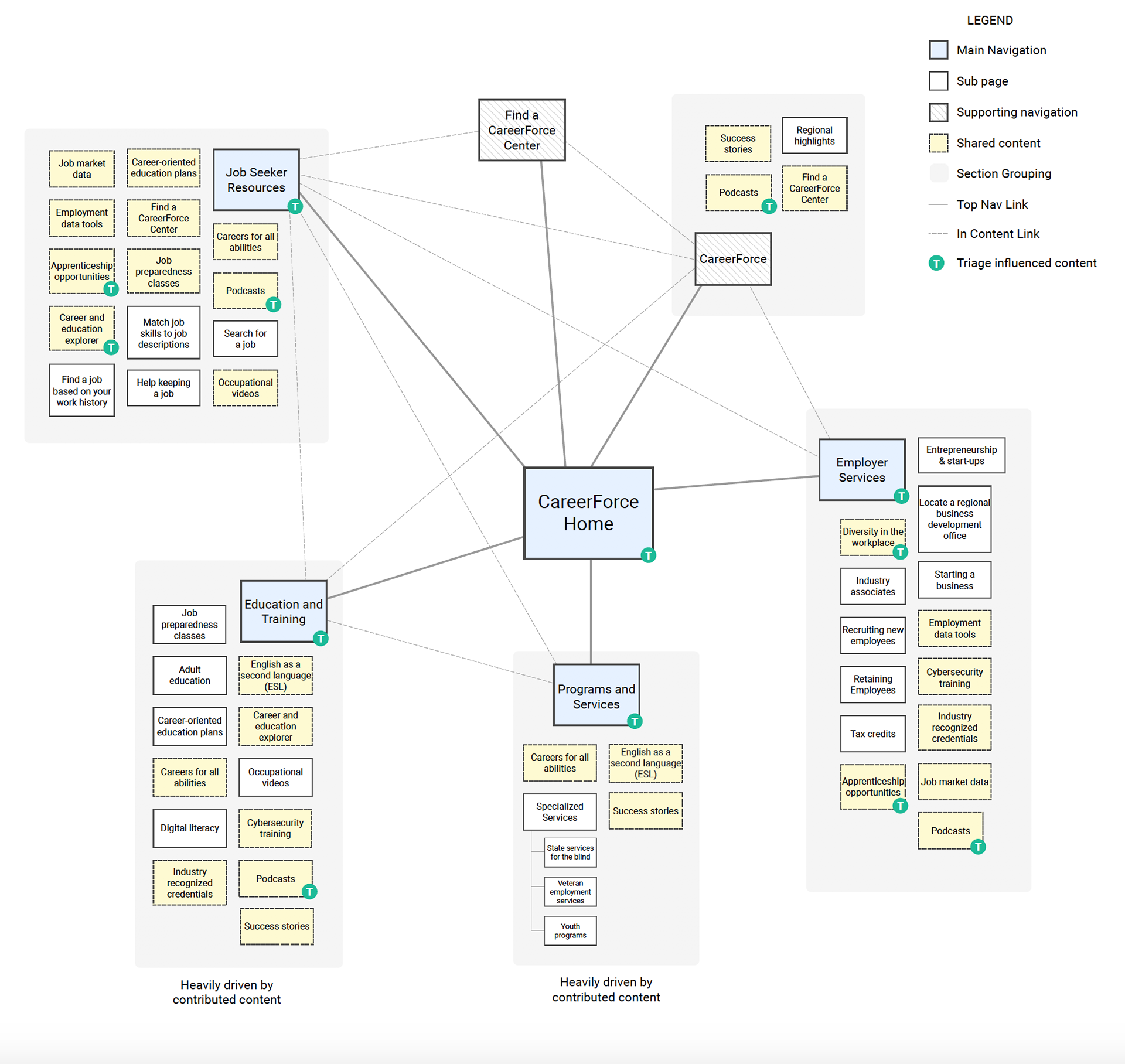
Organizing Content & Defining Information Architecture
card sort study
Card sorts help us learn more about how our users think about and categorize information. This is particularly important in defining a new platform. We ran the card sort remotely through Optimal Workshop’s OptimalSort tool. We had a total of 69 participants organize 30 cards into categories and name them. We visualized the data in several ways to get a rounded perspective on the results.
dendrogram
A dendrogram is used to illustrate data clusters and is most useful when working with a smaller set of participants.
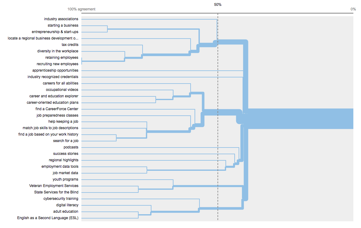
SIMILARITY MATRIX
This visualization shows the percentage of participants who agree with each card pairing. Dark blue areas show strong agreement as to which cards are similar to another. It’s important to note how generally scattered the results are, this shows how disparate the information is as a whole. We should consider renaming cards or moving content from scattered cards to increase agreement.

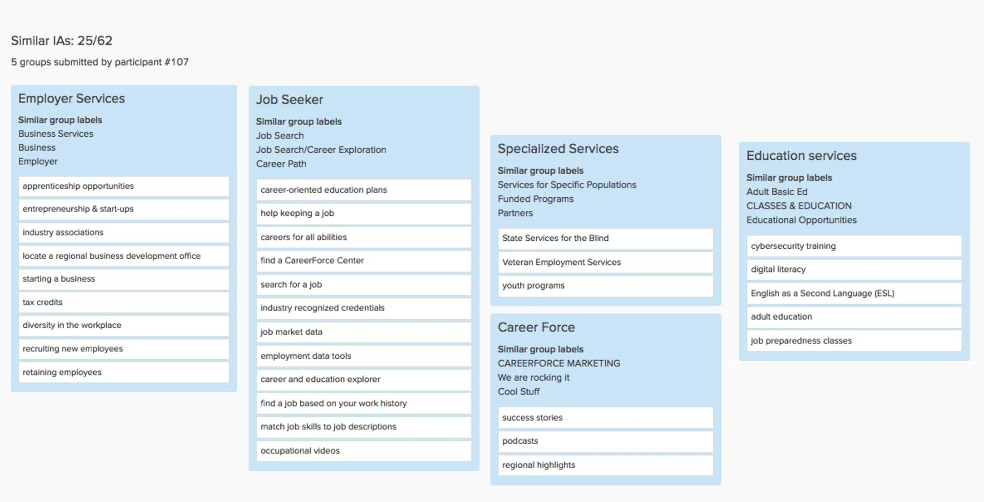
Participant-centric Analysis
One of the various visualizations that Optimal Workshop provides is the Participant-centric Analysis. It presents the top preferred groupings by study participants, based on their similarity with other responses. A total of 25 out of 62 participants chose an information architecture of 5 groups similar to these.
Card Sort Recommendations
There were several comments asking for ways to group cards into multiple categories. This shows us that the content seems very similar based on how it is currently broken up. We also heard that current labels aren’t providing enough context about the content they represent. We should consider a conversational way of introducing the navigation to users or organizing and introducing the navigation within content. It is important to note the study could be partly bias due to the constraints of the card sort software limiting users to associate cards with a single category.
Based on above information we recommended the following sitemap:
tree testing
Now that we received preliminary ideas to create a successful navigation, we decided to put it to the test. We pulled together a Tree Testing activity through Optimal Workshop’s TreeJack product and remotely tested 222 participants by having them complete 4 tasks to evaluate performance of the proposed navigational structure.
We asked participants to complete the following tasks:
Task 1
You’ve heard about a service that does on the job training, where would you go to try and find this service?
You’ve heard about a service that does on the job training, where would you go to try and find this service?
Task 2
You’re interested in hiring a person with disabilities, but you want some assistance on types of accommodations that could be made. Where would you go to learn more about hiring persons with disabilities?
You’re interested in hiring a person with disabilities, but you want some assistance on types of accommodations that could be made. Where would you go to learn more about hiring persons with disabilities?
Task 3
You are currently unemployed and are receiving unemployment benefits. You are looking at changing careers, and are interested in taking a workshop on career planning. Where would you go to see if there is a workshop in your area?
You are currently unemployed and are receiving unemployment benefits. You are looking at changing careers, and are interested in taking a workshop on career planning. Where would you go to see if there is a workshop in your area?
Task 4
You’re interested in moving to Minnesota from Ohio. You’re looking to find out if the job offer you just got is reasonable for the St. Paul area. Where would you go to find out about job market data for your industry?
You’re interested in moving to Minnesota from Ohio. You’re looking to find out if the job offer you just got is reasonable for the St. Paul area. Where would you go to find out about job market data for your industry?
treejack results
The results from participants were organized by TreeJack into the following categories, which help us to see how successful and direct the paths taken by participants were:
Direct Success:
When participants went directly to the correct answer
When participants went directly to the correct answer
Indirect Success:
When participants ended up at the correct answer after backing up through the tree
When participants ended up at the correct answer after backing up through the tree
Direct Failure:
When participants went directly to the incorrect answer
When participants went directly to the incorrect answer
Indirect Failure:
When participants ended up at the incorrect answer after backing up through the tree
When participants ended up at the incorrect answer after backing up through the tree


treejack pietree visualization
TreeJack’s Pietree visualizations show the junctions that participants pass in the information architecture before they find the correct answer. Ideally, this helps us to see if the content was easy or hard to find.
Task 1 Takeaways
This task had the highest percent of direct failure.
• The “For Me” conversational naming convention approach did not seem to be working, so we might consider removing instances of “For” in headings in favor of simple and specific terminology. (This coincides with the earlier usability goal of plain language to support users with lower literacy because in order to understand a conversational dialogue you need to have a higher level of language proficiency.)
• Likewise, the “Partners and Staff” terminology confused some testers. Either rename or remove Partners and Staff from the main navigation to avoid confusion.
Task 2 Takeaways
“Overcoming Barriers” wording didn’t resonate as well as “Diversity in the Workplace.” This told us we should rename “Overcoming Barriers” or move content to “Diversity in the Workplace.”
“Overcoming Barriers” wording didn’t resonate as well as “Diversity in the Workplace.” This told us we should rename “Overcoming Barriers” or move content to “Diversity in the Workplace.”
Task 3 Takeaways
Many looked under “Occupations/careers explorer” to locate workshops. Therefore, we might consider moving workshops under “Occupations/careers explorer” to align with user expectations.
Many looked under “Occupations/careers explorer” to locate workshops. Therefore, we might consider moving workshops under “Occupations/careers explorer” to align with user expectations.
Task 4 Takeaways
People looked for move to Minnesota content under Career Seekers. Thus we should consider moving it to the Career Seekers content, or rename it to better reflect the intended use.
People looked for move to Minnesota content under Career Seekers. Thus we should consider moving it to the Career Seekers content, or rename it to better reflect the intended use.
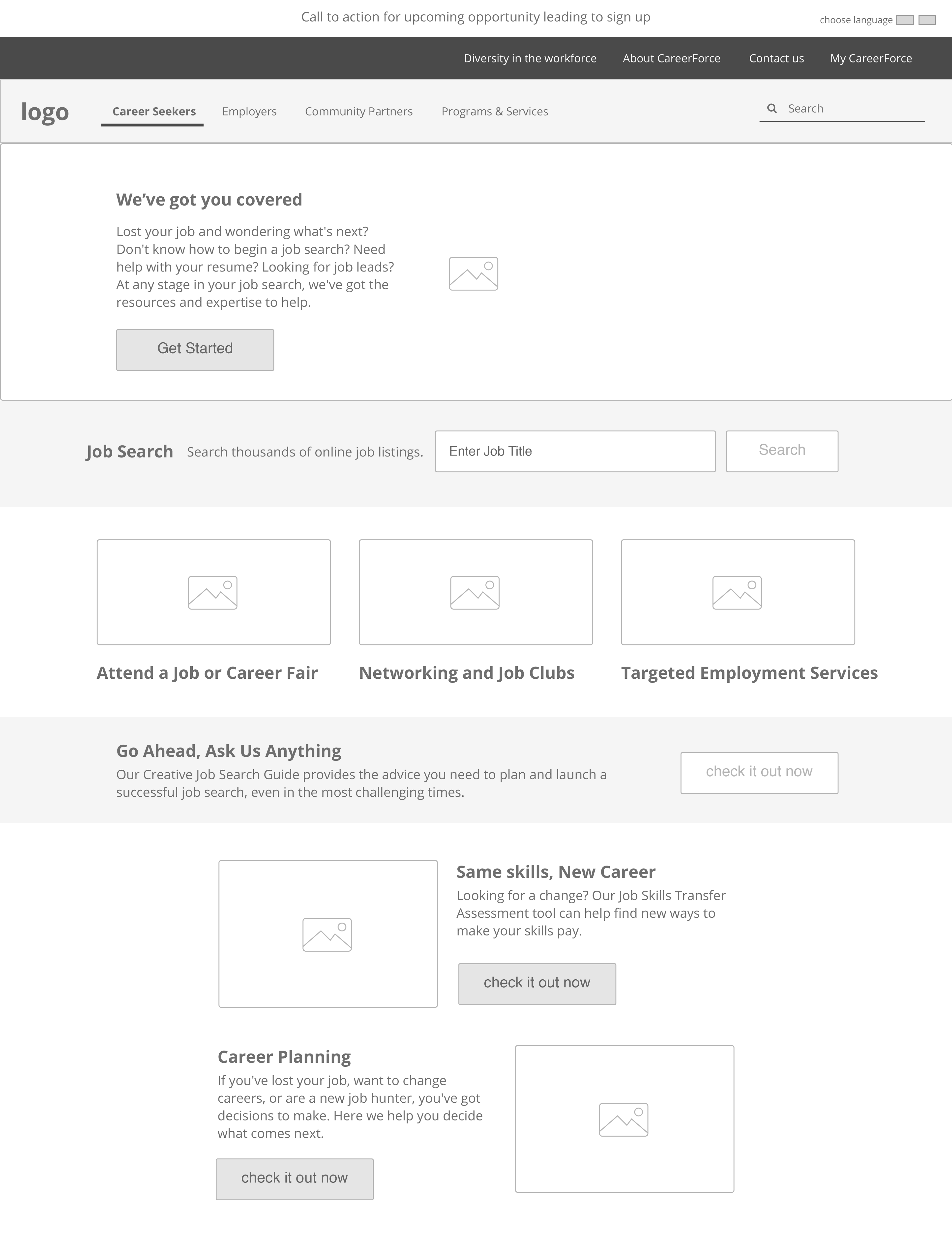
Wireframes & Design Prototype
wireframes
Using the findings we shared in Part 2 as a compass, we were able to bring the desired user experience to life in the wireframes created with Sketch.
Project stakeholders and subject matter experts reviewed and vetted these wireframes. We then iterated upon the design until they met the objectives requested by users. Ideally this process would have included additional end-user testing, but the timeline limited our ability to do this. Furthermore, we felt the feedback from SMEs, along with the heuristic analysis, was enough to reach our goals for the project.
We then shared the wireframes with the development team and made some small changes based on technical feasibility constraints. After several revisions of the wireframes, we collaborated with our visual design team to put together the high fidelity prototypes.

Design Prototypes
The graphic designer on the project took the lead at this point. He consulted the wireframes to determine the best way to merge them with the visual brand identity of the agency, that had been developed in parallel with a separate design vendor. They provided photography guidance and a developed limited color palette of blue and green, with accent colors for highlighted areas.
The graphic designer used Sketch to develop multiple design iterations based on the wireframes and brand identity. These were vetted internally by the design team. The two best options were presented to the stakeholders via InVision. We provided examples of the homepage and navigation, as well as the essential interior pages and clickable examples of functionality. The designs were vetted, creative feedback provided, and adjustments made.