Project description
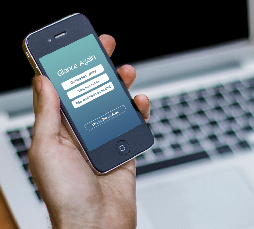
I developed and designed Glance Again, a productivity mobile app, as part of a group in my graduate school work. It is unlike any other in the productivity or utilities category because it allows users to take screen captures of other mobile apps to be viewed for a specified period of time without being locked out from inactivity and having to navigate back to the content. It can be used for anything that needs to be referenced quickly, such as lists, notes, and pictures. When designing this mobile application, we decided to take a user centered design approach.
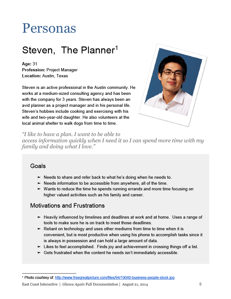
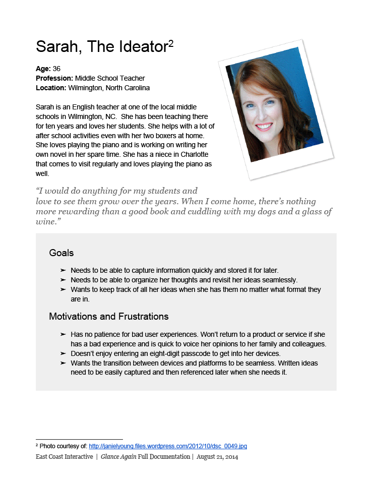
Personas
We created personas to support requirements gathering activities and define task flow.
Requirements gathering
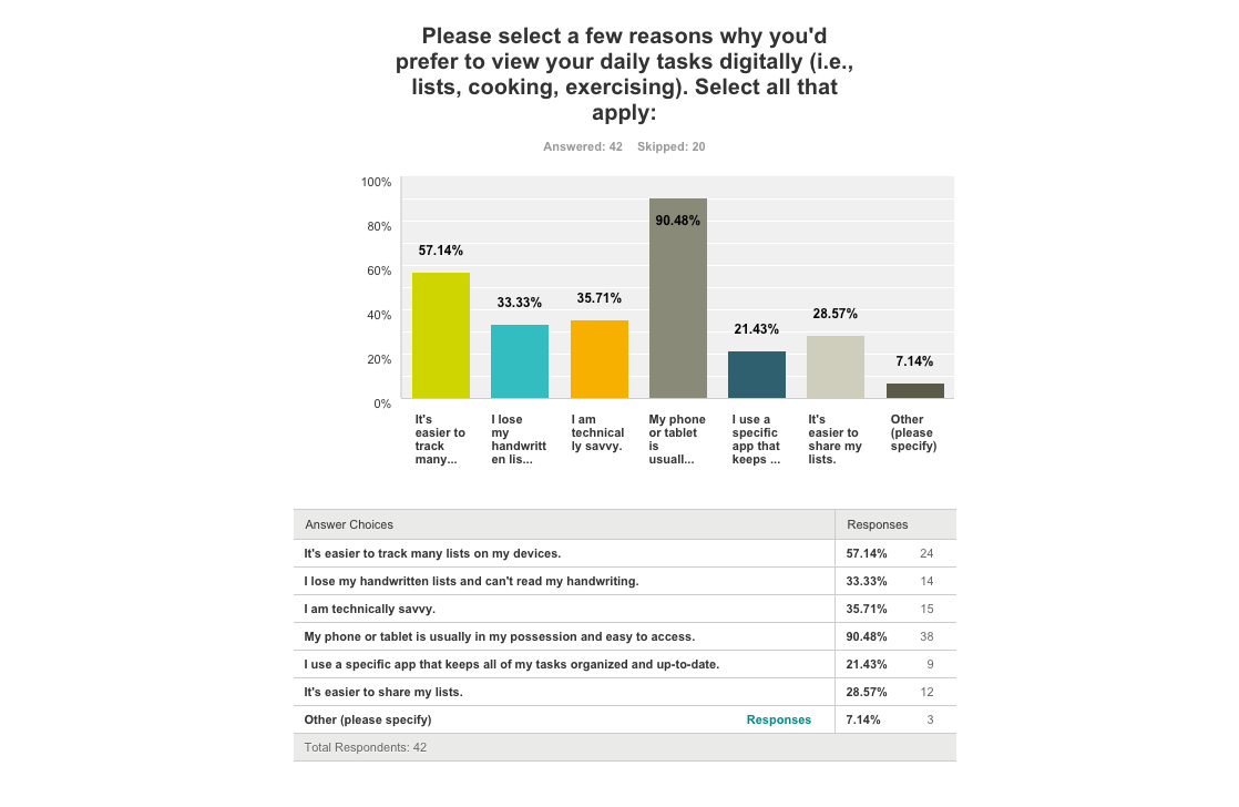
We chose to use surveying and interviewing methods to collect accurate data to influence our requirements. The questions provided were open-ended and interviewers used the survey as a guide for asking consistent questions. Seven interviews were conducted with target audience members.
The survey's objective was to understand how people currently reference content for extended periods of time (i.e., recipes, workouts, grocery lists, etc.). We were also looking to understand whether participants preferred to reference content digitally or non-digitally (i.e., handwritten) and why. Understanding how target users currently digest this type of information helped to drive the requirements for an application to assist users in this area.
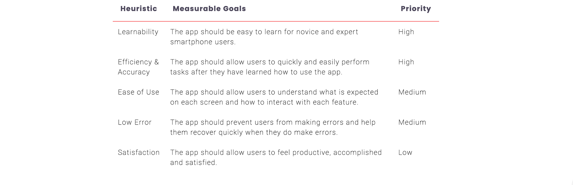
Usability goals
Use Cases
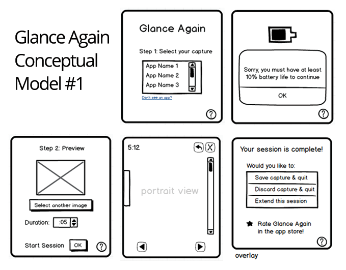
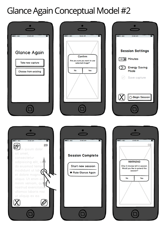
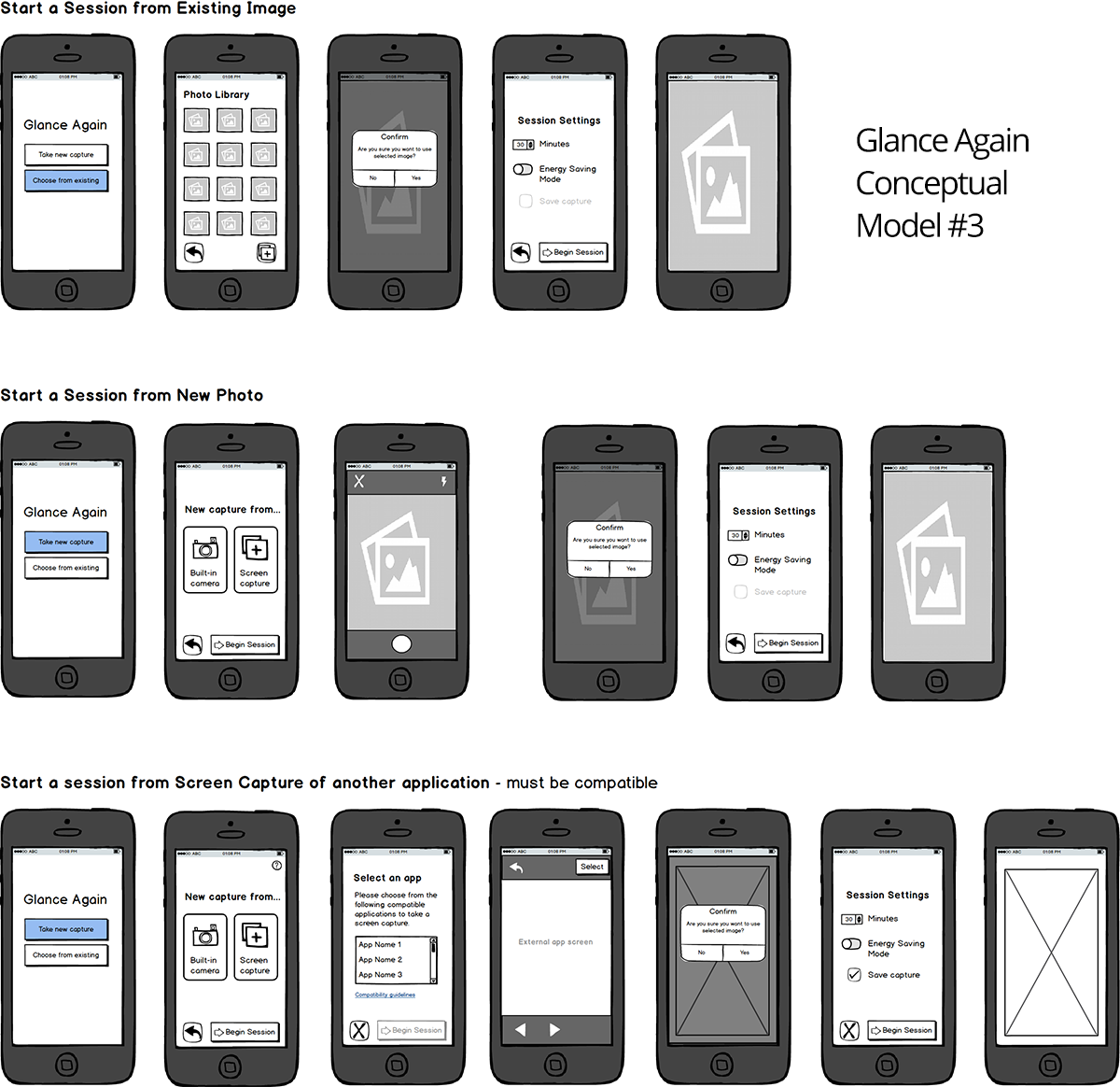
We created three low-fidelity, vertical prototypes to be used for user testing during the Evaluation phase.
U1. START A SESSION
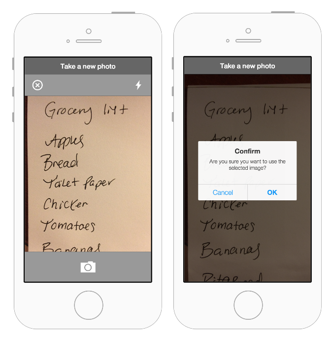
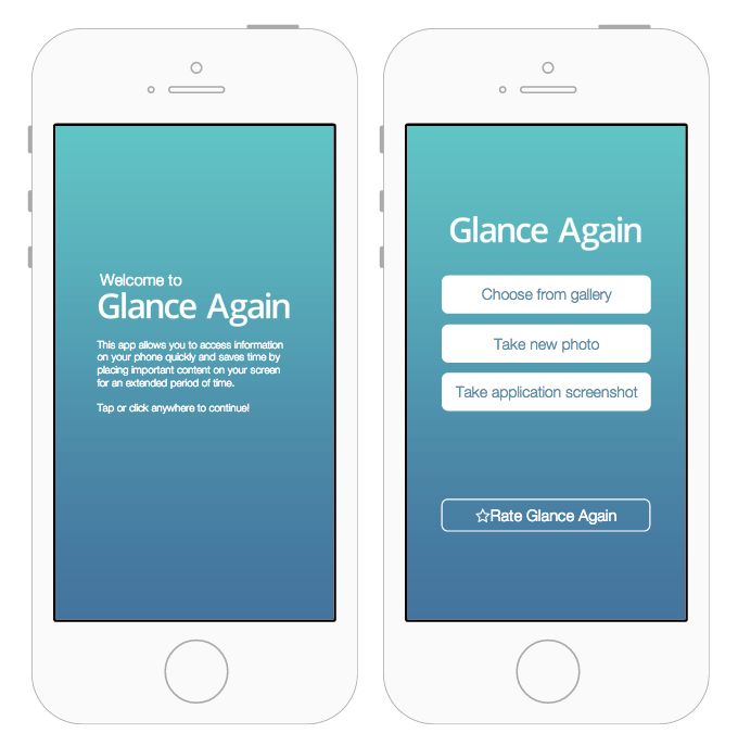
The user chooses to navigate to any other compatible app within the app or take a photo to start a viewing session.
U2. DEFINE A SESSION DURATION
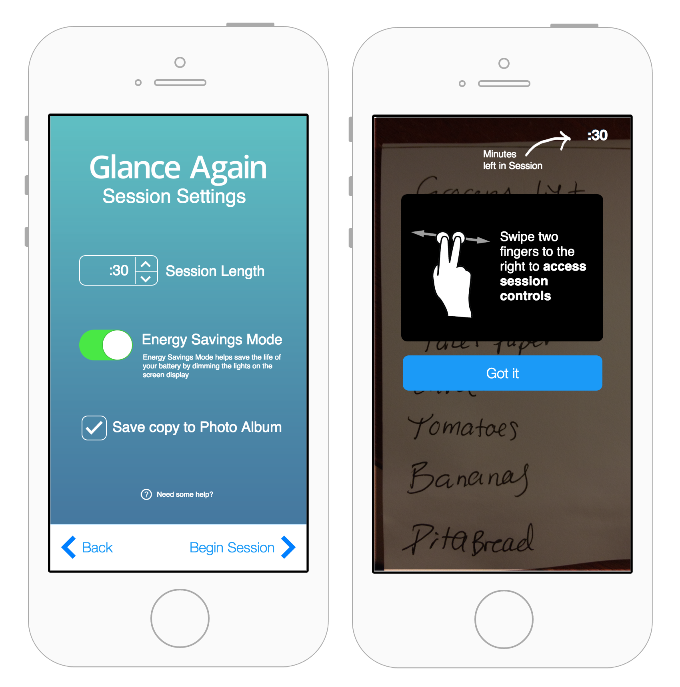
The user sets the duration of the session. The chosen content will persist on screen until the session is complete and the session duration is met.
U3. EXTEND A SESSION
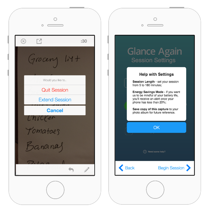
At any point during or at the conclusion of a session, the user can extend that current session to last beyond the original duration that was set previously.
U4. EDIT AND ANNOTATE A SESSION
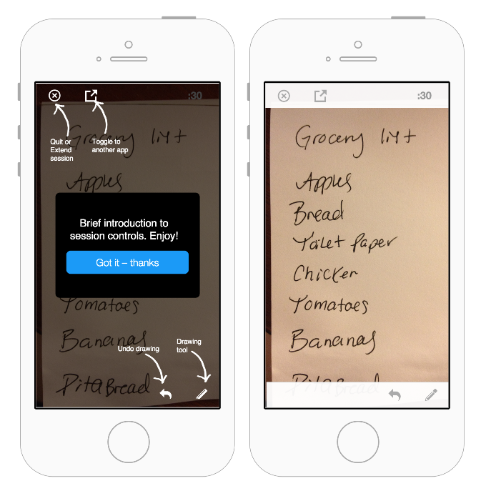
During the session, the user can perform limited interactions with the chosen content (i.e., scrolling in order to view more content, annotating to cross off list items or make notes, canceling the viewing session and toggle between other compatible apps).
U5. VIEW HELP CONTENT
The user can view help content to learn about all available functionality and to access the app settings. The system also notifies the user with help content, such as a deficient battery that may end a session early.
Usability testing
The usability test methodology we used was informal in nature and provided qualitative data addressing the usability needs for the Glance Again app. We asked users to to complete the following use cases: start a session, view and draw in session, and extend a session. As users completed tasks we asked then to think out loud and rate the experience for its ease of use. The feedback from testing drove further iterations to the prototype.
KEY FINDINGS
1. The purpose of the app wasn’t immediately obvious to the user. As a newer concept, they didn’t have any previous experience with a similar app that they could be applied to this app.
2. When given the task to create one of three different captures, the user didn’t select the capture that we had expected.
3. Users didn’t understand exactly which apps would be compatible.
4. Users didn’t understand whether choosing existing images would be from their phone’s photo gallery or the app’s photo gallery of previously saved images.
5. Users wanted to know what would happen upon closing the app. They didn’t know if they would be brought back into a paused session, or have to start a new session.
6. Users expected to interact more within sessions rather than just draw on top of sessions.
Iterative design changes
Based on the findings and observations from usability testing, we made the following design changes. The final prototype was created in Proto.io.
1. Include introductory content to introduce the purpose and functionality of the app. As a new concept, users aren’t able to apply previous knowledge to the activity. A welcome screen and/or overlay help feature may be necessary to provide first time users with the direction they need.

2. Include help content post-introduction to the app throughout the experience. At any time, a user should be able to read help content if they are still learning and get stuck.
3. Provide a more polished prototype. Iconography and some light design treatment will be applied to emphasize each feature and the intended flow of the experience.